
In the world of ecommerce, your email list is one of your most valuable assets. That’s why a well-crafted popup form — designed to convert visitors into subscribers — can directly impact your revenue and long-term growth. If your pop-up form converts poorly, your entire email strategy will suffer—because weak signups lead to weak flows and campaigns over time.
This guide breaks down:
✅ What popup forms are
✅ Why they’re the most effective email capture type
✅ The must-have components of a high-converting popup
✅ Common mistakes (and how to fix them) so you maximize sign-ups and profitability
✨ What is a Popup Form?
A popup form is a small window or overlay that appears on a visitor’s screen while they browse your site, usually asking them to sign up for your email list.
Unlike static signup forms (like a sidebar or footer opt-in), popups instantly capture attention. When paired with an enticing offer (like a discount or free shipping), they become a powerful tool for growing your subscriber list.
🚀 Why Popup Forms Are So Valuable
They’re the highest converting list builder.
Studies show that popups can drive conversion rates between 3% and 11%, depending on the offer, timing, and targeting — far higher than typical embedded forms.
That means if you have 10,000 monthly visitors, a good popup could net you 300–1,100 new subscribers every month. Over time, these new subscribers fuel repeat sales, holiday campaigns, and more.
They increase long-term profitability.
Email is your owned channel. Once you’ve captured a lead, you can market to potential customers over and over — without paying per click like you would with ads. A great popup lowers your customer acquisition costs (CAC) and boosts customer lifetime value (CLV), improving your bottom line.
🛠️ Components of a Powerful & Effective Pop-up Form
It’s important to recognize that popup form performance isn’t driven by design alone — audience demographics play a huge role. Research consistently shows that responsiveness to email marketing varies across age and gender groups: older consumers and women are generally more likely to engage, while younger audiences and men tend to be less responsive overall.
This is why you may find that a simple, average-looking popup can sometimes outperform expectations with a 10% conversion rate, while a sleek, well-designed form may only manage 4%.
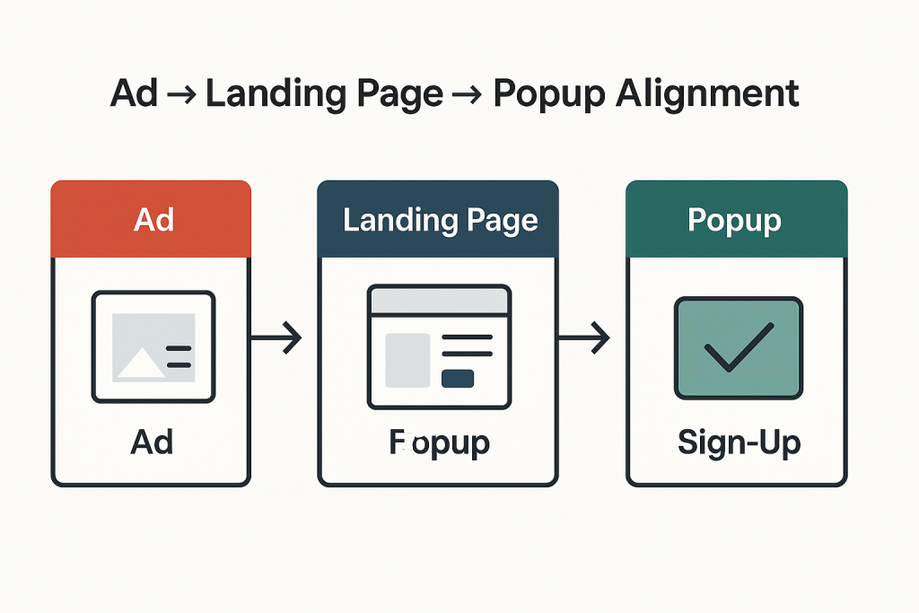
When designing your popup form, it’s essential to keep the customer journey front and center. Think about what a visitor already knows about your brand at the moment they see the form.
Most people arriving on your site are coming either from an ad or from organic content you’ve shared elsewhere. They’ll click through and encounter your popup. This is the very first checkpoint in their journey with you — and it needs to feel consistent with what they already know about you.
Your offer and messaging should directly connect to what they’ve just seen in the ad or content that brought them here. If the popup aligns with their expectations and reinforces the value they already associate with your brand, it feels natural and trustworthy. If it feels disconnected, confusing, or irrelevant, you risk losing them before they ever join your list.
For example: if someone clicks on a Meta ad for your new sustainable denim collection, the popup they see should highlight that exact benefit — “Sign up now for early access to our eco-friendly denim line.” This consistency reassures them they’re in the right place and makes the transition from ad → site → signup seamless.
✅ Ad → Landing Page → Popup Alignment Checklist
- Ad Messaging
- Does your popup reflect the same promise, benefit, or product shown in the ad?
- Example: Ad highlights eco-friendly denim → Popup offers early access to the denim line.
- Visual Consistency
- Are the images, colors, and design elements consistent across ad, site, and popup?
- Consistent visuals build trust and reassure visitors they’re in the right place.
- Offer Continuity
- Is the offer in your popup relevant to the intent behind the ad/content click?
- Example: Ad promotes a sale → Popup offers extra savings or VIP access to the sale.
- Customer Expectations
- Does the popup feel like a natural next step in the journey?
- If it feels jarring or irrelevant, rethink the messaging.
- Seamless Flow
- Ad → Landing page → Popup should feel like a single, connected conversation.
- Ask yourself: If I clicked this ad, would this popup feel like the right next step?
The key takeaway is that list growth isn’t purely about design aesthetics — it’s about aligning the right offer and message with the right audience. That’s why testing is essential. When you tailor your forms and incentives to match the expectations of different demographics, you turn what seems like “randomness” into a repeatable, scalable strategy.
Elements of a High-Converting Pop-up Form
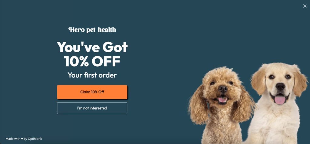
A Strong Offer
Your offer is the leading indicator of popup performance—it’s what ultimately determines whether someone signs up or clicks away. No other factor influences performance as strongly as the incentive you put forward. That doesn’t mean you need to slash your margins with deep discounts like 25% off.
The goal is to strike the right balance between profitability and conversions. In other words, you want to maximize the number of signups while giving away as little as possible on the front end.
The best-performing offers are those that feel valuable to the customer but remain sustainable for your business. Beyond discounts, here are some powerful alternatives you can test:
- Exclusive content (e.g., style guides, recipes, “insider” tips)
- Early access to new product launches or limited-edition drops
- Free shipping or a shipping upgrade
- Free gift with purchase (low-cost, high-perceived-value item)
- Entry into a giveaway or loyalty points for signing up
- First to know alerts for flash sales or VIP-only offers
Follow the matrix below to understand how to find the right offer for your brand:
- High AOV & Lower % Margin? Go for a fixed “$ Off” offer
- Lower AOV & Higher Margin? Go for a “% Off” offer
- Mid-High AOV w/Small & Popular SKUs? Try a “Free Gift with Purchase” offer
By experimenting with these, you can find the sweet spot where your popup delivers high conversions without eroding your margins. Test different offers, as it is the ultimate lead indicator of list growth success.
A Clear and Prominent Value Proposition
Your value proposition should take center stage — bold, clear, and almost jumping off the page — with every other element kept secondary. When visitors arrive from social media, they’re often distracted and not in a highly focused state of mind.
That’s why you need to grab their attention instantly and make it crystal clear: what’s in it for them if they join your email list? The quicker they understand the benefit, the more likely they are to convert.
Value Proposition Best Practices for Popups
- Lead with the benefit — spell out what subscribers gain (discount, exclusive access, useful content).
- Keep it short and clear — one powerful sentence or phrase works better than long explanations.
- Make it visually dominant — larger font, bold text, or contrasting color so it “jumps off the page.”
- Use action-oriented language — “Get,” “Unlock,” “Enjoy,” instead of passive wording.
- Address their state of mind — assume they’re distracted; clarity beats cleverness.
- Support with visuals — icons, product images, or social proof to reinforce the promise.
High-Converting Value Proposition Examples
- Unlock 10% Off Your First Order Today
- Be the First to Shop Our New Collection
- Get Free Shipping on Your Next Purchase
- Join 25,000+ Happy Customers Who Save Weekly
- Exclusive VIP Access — Sales Before Anyone Else
- Your Guide to Effortless Style — Free When You Sign Up
- Win a $100 Gift Card — Join the List to Enter
- Never Miss a Drop — Early Access Straight to Your Inbox
- Discover Insider Tips & Tricks You Won’t Find on Social Media
- Enjoy Members-Only Perks (Without the Membership Fee)
A Micro-Commitment + Zero Party data Collection
One of the most powerful psychological levers in marketing is the micro-commitment principle. Lead with a discount micro-commitment: “Want 10% off today?” People are far more likely to follow through on a larger action once they’ve already taken a smaller, low-friction step (saying yes). Pairing a micro-commitment with zero-party data collection turns your pop-up from an interruption into a helpful, high-converting moment.
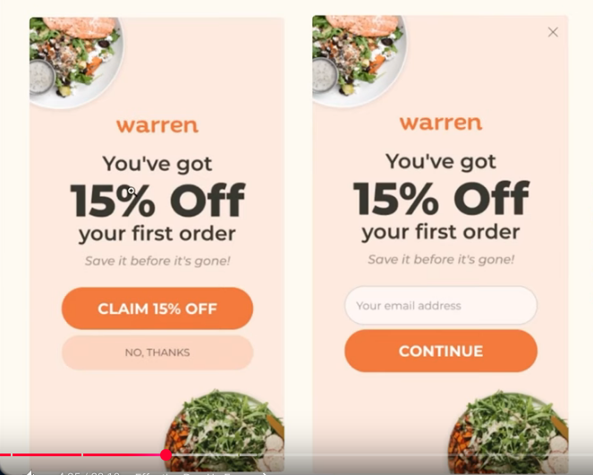
In practice, this means starting with the smallest possible ask — such as a simple Yes/No question — before leading into bigger commitments like entering an email, opting into SMS, or redeeming a discount code. Each small “yes” conditions the visitor to say “yes” again, making it feel natural to continue.
Micro-Commitment Ideas to Capture Phone Numbers
- Exclusive Upgrade Offer
“Want an extra 5% off? Enter your number and we’ll text it to you instantly.” - Early Access Hook
“Be the first to shop new drops. Add your number for early access before anyone else.” - Shipping/Order Perks
“Want real-time shipping updates? Add your number to track your order by text.” - VIP List Framing
“Join our VIP text list for members-only offers and insider perks.” - Limited-Time Incentive
“Get a bonus gift with your first order — we’ll text you the code.”
This layered approach not only increases signups but also creates a more engaged, higher-quality list, since subscribers are progressively choosing deeper levels of connection with your brand.
Leave a Reply