In ecommerce, your email list is pure gold. It powers high-ROI campaigns, fuels automated flows, and builds direct relationships with your customers.
What is A/B testing?
A/B testing (also called split testing) means comparing two (or more) variations of your pop-up to see which performs better.
For example:
Version A: 10% off offer, shows on loading
Version B: 10% off offer, shows after 4 seconds
You then send a portion of your traffic to each version, and measure which one drives more sign-ups (or ultimately more revenue).
Why is A/B testing your pop-up so important?
✅ Improves conversion rates: Tiny tweaks — a new headline, a different photo, 3-second timing shift — can sometimes double your opt-in rate.
✅ Eliminates guesswork: Rather than relying on gut feelings or copying competitors, you learn exactly what resonates with your audience.
✅ Maximizes your traffic ROI: You’ve already paid for or earned that site traffic. Optimizing your pop-ups means more leads from the same number of visitors, reducing your customer acquisition costs.
Top A/B tests to Run on Your Pop-up Forms
1. The offer itself
The offer is the heart of your popup form, and testing it should be your first priority. Every customer demographic reacts differently to different types of offers. Some audiences respond best to monetary discounts, while others prefer perks like free shipping, a free gift, or access to exclusive content. By running split tests on different offers, you’ll quickly discover which incentive resonates most with your visitors and maximizes conversions — without unnecessarily cutting into your profit margins.
Test:
Discount vs. perk: 10% off vs. free shipping
Dollar vs. percent: $10 off vs. 10% off.
Cash back.
Free shipping.
Free gift with purchase.
Mystery offers: “Spin to reveal your discount” vs. clear offer.
Even small differences in how you phrase or structure the deal can change conversion rates dramatically.
2. Urgency cues
Scarcity and urgency are proven psychological triggers that can boost conversions, but their effectiveness varies by audience. Testing urgency cues will show you whether this motivates your audience or feels too pushy.
Test:
Popups with countdown timers “Limited-time offer” No urgency cues at all.
3. Time delay & trigger
When your popup appears is just as important as what it says. Split test triggers such as instant load, timed delay (e.g., 5–10 seconds), exit-intent, and scroll depth. Some visitors will convert best when the popup appears as the site loads, while others need time to explore before being prompted. Testing helps you find the sweet spot for your audience.
✅ Test:
0, 4, 6, 8, 10 or 12 seconds after landing.
Triggers like 30% scroll depth vs. exit-intent (triggering as they move to close the tab).
A/B testing these can help you find the sweet spot for your specific audience.
4. Call to Action
The CTA button is where the magic happens — it’s the final push that turns a visitor into a subscriber. The more action-oriented and benefit-driven your CTA, the better your chances of converting. See which phrasing drives the highest click-throughs.
✅ Test different button texts such as:
“Join Now”
“Add to Cart”
“Get My Discount”
“Unlock Access”
5. Photo content or graphic style
Images can dramatically influence performance. Test product-focused images, lifestyle photos, or even popups without images to see which drives more engagement. For some brands, showing the product creates excitement; for others, a distraction-free design works better. Let the data guide you.
Test:
Lifestyle vs. product-focused photos.
Photo with a happy person vs. just the item.
No image
Static vs. subtle animations.
Visual changes can produce surprising lifts in engagement. You should also test the placement of the photos either next to the form or as a backdrop to the form.
6. Copy & headline
Your headline is the first thing people notice, and often the deciding factor in whether they engage or ignore the popup. Test variations that highlight a clear benefit, create curiosity, or inject urgency. Even subtle shifts in tone can make a huge difference in how compelling your popup feels. Try:
“Get 10% Off” vs. “Claim Your Exclusive 10% Discount”
“Don’t Miss Out”
“Join Our Email List” vs. “Get VIP Early Access & Perks”
“Unlock Something Special”
Fun & playful vs. elegant & minimal.
Also try microcopy tweaks in your CTA buttons like:
“Reveal My Code” vs. “Get My Discount Now”
7. Colors & Design Elements
Visual design shapes first impressions. A bold, colorful popup may grab attention, but a minimalist, clean design may feel less intrusive and convert better. Test variations with different layouts, color schemes, and levels of visual emphasis to find which look aligns best with your brand while still driving signups.
Test:
Contrasting button colors vs. brand-neutral tones.
Dark vs. light pop-up backgrounds.
Subtle shifts here can sometimes lead to significant gains.
8. Form Fields
Every additional field you ask for increases friction. Test forms that ask for email only versus email plus name, name, email and preferences, or email plus SMS. While shorter forms usually convert better, adding a second field might increase lead quality. Split testing helps you strike the right balance between volume and value.
9. Personalization
Generic messaging is easy, but personalization is powerful. Test popups tailored to traffic sources — for example, a visitor from a Facebook ad for a new collection could see “Sign up now for exclusive access to our latest drop,” while an organic blog visitor might see “Join 10,000+ readers getting our weekly style tips.” Personalization creates relevance, which translates into higher conversions.
10. Design and Layout
Visual design shapes first impressions. A bold, colorful popup may grab attention, but a minimalist, clean design may feel less intrusive and convert better. Test variations with different layouts, color schemes, and levels of visual emphasis to find which look aligns best with your brand while still driving signups.
How to A/B test effectively
Change only one element at a time. If you change headline and timing and photo, you won’t know what drove the improvement.
Run tests long enough to get statistically meaningful results. Aim for at least a few hundred views per variant before deciding.
Track beyond sign-ups. Some offers may boost opt-ins but attract low-quality leads who never buy. Integrate with your ESP or store data to see long-term revenue impact.
The Bottom Line
Pop-ups are your most powerful email capture tool. But the difference between a generic, one-size-fits-all pop-up and a rigorously A/B tested pop-up is often thousands in additional revenue every month.
By systematically testing your offer, form type, timing, close options, imagery, copy, and colors, you can dial in the perfect combination that maximizes your list growth — and ultimately, your sales.
Popup forms are one of the most effective tools for growing email and SMS lists—but when done poorly, they can frustrate users, hurt conversions, and damage brand trust.
Many brands set up popup forms with good intentions, yet make simple mistakes that prevent them from performing at their full potential. From asking for too much information too soon to poor timing and unclear value propositions, these missteps quietly cost brands thousands of subscribers and missed revenue opportunities.
In this article, we’ll break down the most common mistakes brands make with popup forms—and show you exactly how to fix them so your forms convert without compromising the customer experience.
1. Weak Offer
Your popup form is often the first direct interaction a visitor has with your brand. If the offer feels weak, generic, or uninspiring—like “Join our newsletter”—it sends the message that you don’t value your subscriber’s attention. A popup form without a compelling offer doesn’t just fail to grow your list—it can actually train visitors to ignore your messaging altogether.
A strong offer gives visitors a clear reason to subscribe now, not later. Here are the key components:
Immediate Value
Discount (e.g., 10% off your first order).
Free shipping.
Free gift with purchase.
Access to exclusive content or VIP perks.
Relevance
Offer tailored to what the visitor cares about (e.g., style guide for a fashion brand, free recipe ebook for a food brand).
Clarity
Simple, direct wording—no jargon or confusion.
Example: “Unlock 10% off instantly” instead of “Sign up for our updates.”
Urgency (Optional)
Add time-sensitive elements: “Today only” or “First 500 subscribers.”
Low Friction
Keep the form short (name + email is often enough).
Reduce effort required to claim the offer.
Weak vs. Strong Popup Offers
Weak Offer
Why It Fails
Strong Offer
Why It Works
“Join our newsletter”
No clear value, generic, uninspiring.
“Get 10% off your first order today”
Immediate, tangible value and urgency.
“Sign up for updates”
Vague—what kind of updates? Why should they care?
“Be the first to access new drops + VIP perks”
Relevant incentive that reduces buying friction.
“Subscribe for news”
Doesn’t answer what’s in it for me?
“Get our exclusive style guide + 15% off”
Offers both content value and a discount.
“Enter your email here”
Transactional, no motivation provided.
“Unlock free shipping on your first purchase”
Builds exclusivity and makes subscriber feel special.
2. Too Many Requests
The best popup forms strike a balance between enticing subscribers to sign up and capturing the right data to fuel personalization. At a minimum, always ask for a name and email address—these two fields let you personalize communication without adding friction.
To go a step further, consider collecting zero party data by including preference fields that are directly relevant to your brand. This will help you send more targeted content to your audience. For example, a fashion brand could ask about preferred styles (casual, minimalist, formal), while a food brand might ask about dietary preferences (vegan, gluten-free, keto). These small, low-friction requests make subscribers feel understood and allow you to tailor content, offers, and recommendations that resonate.
Avoid asking for high-barrier data like physical address in the initial popup, as this can feel intrusive and reduce conversions. The goal is to gather just enough information to deliver value while keeping the sign-up process effortless.
Good vs. Bad Popup Fields
Good Fields to Ask
Why They Work
First Name
Enables simple personalization (e.g., “Hi Sarah”) without adding friction.
Email Address
Essential for campaigns, flows, and ongoing communication.
Useful for brands ready to build SMS lists, but should be framed as a bonus channel.
3. Poor Timing
The timing of your popup form can make or break conversions. Some brands see better results when the form appears instantly on page load, while others get higher conversions waiting 4–8 seconds. Since no single rule applies to all audiences, A/B testing different timings is essential to find the sweet spot for your brand.
Popup Timing Testing Framework
Timing Variation
When It Appears
Metrics to Track
Why Test It
Immediate (0s)
As soon as page loads
Conversion rate, bounce rate
Captures attention before distraction
Short Delay (4s)
4 seconds after load
Conversion rate, engagement time
Allows visitor to orient before prompt
Medium Delay (8s)
8 seconds after load
Conversion rate, bounce rate, exit rate
Engages only those showing interest
Long Delay (15s+)
15 seconds or more
Conversion rate, time on site, exits
Targets highly engaged visitors
Scroll-Triggered
After 25–50% page scroll
Conversion rate, time on site
Reaches users once they show deeper intent
Exit-Intent
On attempt to leave page
Conversion rate, cart abandonment rate
Last-chance offer to save the conversion
By waiting for signs of engagement, your popup feels like a natural part of the customer journey rather than an interruption — which dramatically increases the chances of conversion.
4. Slow Loading
A popup form should enhance your site’s user experience, not sabotage it. Unfortunately, heavy scripts or poorly optimized popup forms can do just that. Slow-loading popups create friction, frustrate visitors, and increase bounce rates—especially on mobile, where speed matters most. Instead of engaging your audience, a sluggish popup makes your brand feel clunky and unprofessional. Even worse, if the popup lags or fails to load properly, you lose a critical opportunity to capture a subscriber altogether.
How to Avoid This Problem
Choose Lightweight Popup Tools – Use forms that are optimized for speed and don’t overload your site with bloated scripts.
Test on Mobile and Desktop – Ensure the popup loads instantly across devices, since most visitors will discover you on mobile.
Limit Third-Party Scripts – Every extra script can slow things down. Only keep the integrations you actually need.
Lazy Load Wisely – Make sure the popup is set to load efficiently without blocking the rest of the page content.
Regular Speed Checks – Test your site’s speed with and without popups (e.g., Google PageSpeed Insights, GTmetrix) to ensure performance isn’t suffering.
Pro Tip: A popup should feel seamless, appearing smoothly and without delay—if it feels heavy to you, it definitely feels heavy to your visitors.
5. Too Small
Small popups may seem subtle, but they often backfire—especially on mobile. When a form is too small, visitors either miss it entirely or struggle to click into it, creating frustration instead of engagement. A better approach is to design a popup that dominates the center of the screen, making it impossible to ignore while still maintaining a clean, user-friendly look. Just as important, always ensure there’s a clearly visible close button so users feel in control. This balance—high visibility without being intrusive—is what maximizes conversions while keeping the user experience positive.
6. Too Much Copy
Popup forms need to grab attention and drive action in seconds. In 2025, attention spans are shorter than they’ve ever been. When you cram your form with paragraphs of text, visitors get overwhelmed and tune out. Long-winded copy makes the popup feel like work instead of an easy opportunity, which leads to lower signups and higher closes. The best-performing popups keep it short and sharp—under 10 words of copy. That means:
One headline that instantly communicates value.
One short sentence of subtext to clarify or add context.
One clear button with a call-to-action (e.g., Get 10% Off).
Less clutter, more clarity—so the visitor’s focus is exactly where it should be: on taking action.
Weak vs. Strong Popup Copy Examples
Weak Copy (Too Much Text)
Strong Copy (Under 10 Words)
“Sign up for our newsletter to get updates, news, and product information. We’ll also send you special offers and let you know when we launch new products.”
Headline:Get 10% Off Today Subtext:Join our list for instant savings. CTA:Claim Discount
“We’d love to keep you updated on our store and products. Subscribe to get notifications about new arrivals and exclusive deals before anyone else. Don’t miss out!”
Headline:Early Access Awaits Subtext:Be first to shop new drops. CTA:Join Now
“Please sign up to our email list to receive our latest news, promotional offers, updates, and announcements. We promise not to spam you.”
Headline:Free Shipping Today Only Subtext:Subscribe to unlock your perk. CTA:Unlock Offer
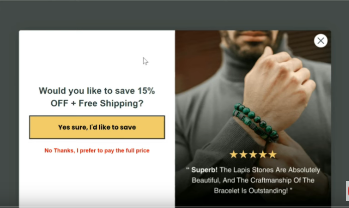
7. Too Easy to Close
A powerful popup strategy is to replace the visible “X” close button with a text-based opt-out link like “No, I’m not interested in saving 20%.” Why does this work? Because when visitors see a popup, their instinct is to immediately click the “X” without even reading the offer. By making the opt-out option the only clear exit, you force them to pause, read the offer, and consciously decide to reject it.
This simple shift increases the likelihood that they’ll reconsider and opt in, because the act of reading “No, I’m not interested in saving 20%” makes the value of the offer explicit. It’s a subtle psychological nudge that keeps attention on your incentive and dramatically improves conversions without adding friction.
Here are 3 strong opt-out copy variations you can use instead of the generic “No, I’m not interested”:
“No thanks, I’ll pay full price.” → Highlights the pain of missing out on a discount.
“No, I don’t want early access to new drops.” → Reinforces exclusivity and scarcity.
“No, I’ll skip my free shipping.” → Frames the opt-out as giving up a tangible benefit.
Pro Tip: The key is to make the opt-out phrasing reflect the value of the offer—so rejecting it feels like a loss.
8. Adding Navigation Links to the Form
Adding navigation links to a popup form distracts visitors from the main action you want them to take—completing the form. Here’s why it negatively affects conversion rates:
1. Distraction from the Primary Goal: A popup form usually has a single purpose—collecting leads, sign-ups, or conversions. By adding navigation links, you’re giving users an “escape route” that pulls them away from the form. Instead of entering their details, they may click off to explore other pages and never return.
2. Decision Fatigue: Every additional link creates more choices for the user. Instead of focusing on one simple decision—“Should I submit this form?”—they’re presented with competing options.” More choices reduce the likelihood of conversion because the user’s attention is fragmented.
3. Loss of Momentum: Popups usually appear when a user is already engaged with your content (e.g., scrolling, exiting, or after a certain time). At this moment, you want to capture that momentum. Sending them elsewhere breaks the flow, lowering the chance they’ll come back to complete the form.
4. Signal of Unclear Priorities: A popup should feel purposeful and direct. When you add navigation links, it dilutes the message and makes the form feel secondary. Instead of showing confidence in the offer, it suggests, “Maybe this form isn’t that important, go look around instead.”
5. Increased Bounce Risk: Once users click a link in the popup, they may not find what they expected, get distracted, or even leave your site entirely. That’s a lost opportunity you could have converted.
Best Practice: A popup form should be laser-focused on one action—sign up, download, or subscribe. Keep it clean, free of distractions, and avoid navigation links. If you need to provide additional information, use microcopy (short explanatory text) within the popup rather than linking out.
9, Not Split Testing Your Form
Without testing different headlines, offers, designs, triggers, and timing, you’re essentially guessing at what will convert best — and leaving money on the table. What resonates with one audience segment may fall flat with another, and even small tweaks can double or triple your conversion rate.
Split testing removes the guesswork, giving you hard data on what actually works so you can refine and scale. Skipping this step means settling for average results when your popup could be performing at its full potential.
High-Impact Popup Elements to Split Test
Offer Type — Discount vs. free shipping vs. free gift vs. exclusive content.
Headline — Benefit-driven vs. curiosity-driven vs. urgency-driven messaging.
Call-to-Action (CTA) — Button text like “Join Now” vs. “Get My Discount” vs. “Unlock Access”.
Timing — Instant load vs. 5-second delay vs. exit-intent vs. scroll depth.
Design & Layout — Minimalist vs. bold design, image-based vs. text-heavy.
Form Fields — Email only vs. email + name vs. email + SMS.
Visual Elements — With product image vs. lifestyle image vs. no image.
Personalization — Generic message vs. segmented by source (e.g., from Facebook ad vs. from Pinterest).
10. Not Optimizing for Mobile
The majority of visitors encountering your popup and receiving your emails will be on a mobile device, so if the form isn’t mobile-friendly, you’re instantly losing conversions. A popup that’s too large, hard to close, or awkward to fill out creates friction and drives people away. To maximize signups, make sure your popup is fully responsive, easy to navigate, and designed with the mobile experience in mind.
11. Asking for Email and SMS on the Same Form
A single “email + SMS” checkbox creates friction, depresses opt-in rates, and—depending on jurisdiction—may be unlawful. Split the asks, make SMS clearly optional with proper disclosures, and you’ll be safer and convert better.
EU/UK (GDPR/PECR): Consent must be specific per channel—email and SMS require separate opt-ins.
US (TCPA): Marketing texts need prior express written consent with required disclosures; consent can’t be a condition of purchase.
Carrier/CTIA rules: If someone opts into your texts, that consent applies to your SMS program. It doesn’t automatically cover email—or a different text campaign.
Using a Flyout Form
Flyout forms consistently underperform compared to popups when it comes to driving email sign-ups and conversions.
Bottom line
A high-converting popup isn’t just a “nice to have” — it’s one of the most profitable tools in your ecommerce marketing stack. It builds your email list, fuels automated flows and campaigns, and dramatically increases your lifetime ROI on every website visitor.
In the world of ecommerce, your email list is one of your most valuable assets. That’s why a well-crafted popup form — designed to convert visitors into subscribers — can directly impact your revenue and long-term growth. If your pop-up form converts poorly, your entire email strategy will suffer—because weak signups lead to weak flows and campaigns over time.
This guide breaks down: ✅ What popup forms are ✅ Why they’re the most effective email capture type ✅ The must-have components of a high-converting popup ✅ Common mistakes (and how to fix them) so you maximize sign-ups and profitability
✨ What is a Popup Form?
A popup form is a small window or overlay that appears on a visitor’s screen while they browse your site, usually asking them to sign up for your email list.
Unlike static signup forms (like a sidebar or footer opt-in), popups instantly capture attention. When paired with an enticing offer (like a discount or free shipping), they become a powerful tool for growing your subscriber list.
🚀 Why Popup Forms Are So Valuable
They’re the highest converting list builder.
Studies show that popups can drive conversion rates between 3% and 11%, depending on the offer, timing, and targeting — far higher than typical embedded forms.
That means if you have 10,000 monthly visitors, a good popup could net you 300–1,100 new subscribers every month. Over time, these new subscribers fuel repeat sales, holiday campaigns, and more.
They increase long-term profitability.
Email is your owned channel. Once you’ve captured a lead, you can market to potential customers over and over — without paying per click like you would with ads. A great popup lowers your customer acquisition costs (CAC) and boosts customer lifetime value (CLV), improving your bottom line.
🛠️ Components of a Powerful & Effective Pop-up Form
It’s important to recognize that popup form performance isn’t driven by design alone — audience demographics play a huge role. Research consistently shows that responsiveness to email marketing varies across age and gender groups: older consumers and women are generally more likely to engage, while younger audiences and men tend to be less responsive overall.
This is why you may find that a simple, average-looking popup can sometimes outperform expectations with a 10% conversion rate, while a sleek, well-designed form may only manage 4%.
When designing your popup form, it’s essential to keep the customer journey front and center. Think about what a visitor already knows about your brand at the moment they see the form.
Most people arriving on your site are coming either from an ad or from organic content you’ve shared elsewhere. They’ll click through and encounter your popup. This is the very first checkpoint in their journey with you — and it needs to feel consistent with what they already know about you.
Your offer and messaging should directly connect to what they’ve just seen in the ad or content that brought them here. If the popup aligns with their expectations and reinforces the value they already associate with your brand, it feels natural and trustworthy. If it feels disconnected, confusing, or irrelevant, you risk losing them before they ever join your list.
For example: if someone clicks on a Meta ad for your new sustainable denim collection, the popup they see should highlight that exact benefit — “Sign up now for early access to our eco-friendly denim line.” This consistency reassures them they’re in the right place and makes the transition from ad → site → signup seamless.
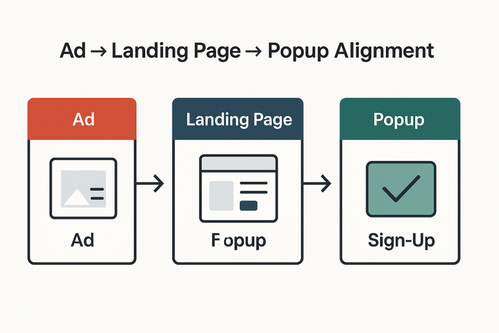
✅ Ad → Landing Page → Popup Alignment Checklist
Ad Messaging
Does your popup reflect the same promise, benefit, or product shown in the ad?
Example: Ad highlights eco-friendly denim → Popup offers early access to the denim line.
Visual Consistency
Are the images, colors, and design elements consistent across ad, site, and popup?
Consistent visuals build trust and reassure visitors they’re in the right place.
Offer Continuity
Is the offer in your popup relevant to the intent behind the ad/content click?
Example: Ad promotes a sale → Popup offers extra savings or VIP access to the sale.
Customer Expectations
Does the popup feel like a natural next step in the journey?
If it feels jarring or irrelevant, rethink the messaging.
Seamless Flow
Ad → Landing page → Popup should feel like a single, connected conversation.
Ask yourself: If I clicked this ad, would this popup feel like the right next step?
The key takeaway is that list growth isn’t purely about design aesthetics — it’s about aligning the right offer and message with the right audience. That’s why testing is essential. When you tailor your forms and incentives to match the expectations of different demographics, you turn what seems like “randomness” into a repeatable, scalable strategy.
Elements of a High-Converting Pop-up Form
A Strong Offer
Your offer is the leading indicator of popup performance—it’s what ultimately determines whether someone signs up or clicks away. No other factor influences performance as strongly as the incentive you put forward. That doesn’t mean you need to slash your margins with deep discounts like 25% off.
The goal is to strike the right balance between profitability and conversions. In other words, you want to maximize the number of signups while giving away as little as possible on the front end.
The best-performing offers are those that feel valuable to the customer but remain sustainable for your business. Beyond discounts, here are some powerful alternatives you can test:
Early access to new product launches or limited-edition drops
Free shipping or a shipping upgrade
Free gift with purchase (low-cost, high-perceived-value item)
Entry into a giveaway or loyalty points for signing up
First to know alerts for flash sales or VIP-only offers
Follow the matrix below to understand how to find the right offer for your brand:
High AOV & Lower % Margin? Go for a fixed “$ Off” offer
Lower AOV & Higher Margin? Go for a “% Off” offer
Mid-High AOV w/Small & Popular SKUs? Try a “Free Gift with Purchase” offer
By experimenting with these, you can find the sweet spot where your popup delivers high conversions without eroding your margins. Test different offers, as it is the ultimate lead indicator of list growth success.
A Clear and Prominent Value Proposition
Your value proposition should take center stage — bold, clear, and almost jumping off the page — with every other element kept secondary. When visitors arrive from social media, they’re often distracted and not in a highly focused state of mind.
That’s why you need to grab their attention instantly and make it crystal clear: what’s in it for them if they join your email list? The quicker they understand the benefit, the more likely they are to convert.
Value Proposition Best Practices for Popups
Lead with the benefit — spell out what subscribers gain (discount, exclusive access, useful content).
Keep it short and clear — one powerful sentence or phrase works better than long explanations.
Make it visually dominant — larger font, bold text, or contrasting color so it “jumps off the page.”
Use action-oriented language — “Get,” “Unlock,” “Enjoy,” instead of passive wording.
Address their state of mind — assume they’re distracted; clarity beats cleverness.
Support with visuals — icons, product images, or social proof to reinforce the promise.
High-Converting Value Proposition Examples
Unlock 10% Off Your First Order Today
Be the First to Shop Our New Collection
Get Free Shipping on Your Next Purchase
Join 25,000+ Happy Customers Who Save Weekly
Exclusive VIP Access — Sales Before Anyone Else
Your Guide to Effortless Style — Free When You Sign Up
Win a $100 Gift Card — Join the List to Enter
Never Miss a Drop — Early Access Straight to Your Inbox
Discover Insider Tips & Tricks You Won’t Find on Social Media
Enjoy Members-Only Perks (Without the Membership Fee)
A Micro-Commitment + Zero Party data Collection
One of the most powerful psychological levers in marketing is the micro-commitment principle. Lead with a discount micro-commitment: “Want 10% off today?” People are far more likely to follow through on a larger action once they’ve already taken a smaller, low-friction step (saying yes). Pairing a micro-commitment with zero-party data collection turns your pop-up from an interruption into a helpful, high-converting moment.
In practice, this means starting with the smallest possible ask — such as a simple Yes/No question — before leading into bigger commitments like entering an email, opting into SMS, or redeeming a discount code. Each small “yes” conditions the visitor to say “yes” again, making it feel natural to continue.
Micro-Commitment Ideas to Capture Phone Numbers
Exclusive Upgrade Offer “Want an extra 5% off? Enter your number and we’ll text it to you instantly.”
Early Access Hook “Be the first to shop new drops. Add your number for early access before anyone else.”
Shipping/Order Perks “Want real-time shipping updates? Add your number to track your order by text.”
VIP List Framing “Join our VIP text list for members-only offers and insider perks.”
Limited-Time Incentive “Get a bonus gift with your first order — we’ll text you the code.”
This layered approach not only increases signups but also creates a more engaged, higher-quality list, since subscribers are progressively choosing deeper levels of connection with your brand.
Popup forms are one of the most essential tools to capture leads, grow your email list, and drive conversions. However, a poorly executed popup can frustrate users, reduce engagement, deter potential customers and harm your brand’s credibility.
Why Pop-ups Matter for Website Conversions
An effective pop-up grabs attention at the right moment, turn passive visitors into active participants, increase lead capture, and provide opportunities to optimize your marketing funnel—making them a powerful tool for increasing website conversions without disrupting the overall user experience.
Conducting a systematic popup form audit ensures that your forms are optimized for both conversions and user experience.
1. Define Objectives and KPIs
Before auditing, clarify the purpose of your popup form. Ask yourself:
What is this popup designed to achieve? (e.g., newsletter sign-ups, lead generation, promotional offers)
What metrics will define success? (conversion rate, CTR, bounce rate, submissions)
Having clear goals sets the benchmark for evaluating the form’s effectiveness.
2. Evaluate Design & User Experience (UX)
Visual Design:
Ensure the popup is visually appealing and aligns with your brand.
Check color schemes, typography, images, and layout for clarity and readability.
CTA & Copy:
Headlines should be attention-grabbing and benefit-focused.
Copy should be concise, persuasive, and clearly communicate the value of signing up.
CTA buttons should stand out, use actionable text (e.g., “Get My Discount”), and guide the user toward action.
Form Fields:
Limit the number of fields to reduce friction. Only ask for essential information.
Consider progressive profiling for future interactions.
Mobile Responsiveness:
Verify that the popup works seamlessly on all screen sizes and devices.
Ensure buttons are tappable, fields are easy to fill, and text is readable.
3. Review Timing & Triggers
The timing of your popup can make or break conversions:
Entry popups: Appear immediately upon visiting the page—conduct A/B tests to evaluate their effectiveness.
Exit-intent popups: Trigger when a user is about to leave—great for capturing abandoning visitors, and may be more effective at driving conversions than entry popups.
Scroll-triggered popups: Appear after a user scrolls a certain percentage down the page—engages active readers.
Time-delay popups: Appear after a set time—ensure the user has had enough time to understand the page content.
Test different triggers and timing to find the balance between engagement and annoyance.
4. Test Functionality
Ensure all form fields are working correctly.
Verify integrations with your CRM, email marketing platform, or automation tools.
Test any incentives (discounts, downloadable content) to ensure they are delivered reliably.
Check error messages and validation to make them user-friendly.
5. Analyze Copy & Value Proposition
Make the benefit of signing up obvious (“Get 10% off your first purchase,” “Exclusive tips delivered weekly”).
Avoid including too many links or options that distract from the main goal.
Personalize messaging where possible (location-based offers, dynamic content).
6. Check Deliverability & Compliance
Ensure collected emails are verified if required.
Stay compliant with GDPR, CAN-SPAM, and other privacy regulations.
Include clear opt-out/unsubscribe options.
Make sure privacy policies are accessible and transparent.
Birthdays are personal, memorable moments. When used strategically in marketing, they offer a golden opportunity to build stronger customer relationships, increase engagement, and even drive sales. That’s where a birthday flow comes in—a series of automated emails that celebrate a subscriber’s special day while providing meaningful value.
Why You Should Set Up a Birthday Flow
Deepen Customer Relationships – Recognizing a customer’s birthday shows that your brand cares about them personally, not just as a sale.
Increase Engagement – Birthday emails enjoy higher open and click-through rates compared to regular campaigns.
Drive Conversions – Offering a birthday discount or special offer encourages purchases at the perfect moment.
Collect Valuable Data – Birthday flows give you insights into your audience demographics and preferences.
How to Collect Birthday Information Effectively
Getting the birthday property from your subscribers is essential for a successful birthday flow. Here are some proven methods:
1. Multi-Step Popup Forms
An interactive multi-step form is one of the most effective ways to collect birthdays.
Why it works: Multi-step forms break down the input into smaller, less intimidating steps, keeping users engaged and improving completion rates.
2. Sending a Campaign to Your Entire List
Send an email asking subscribers to update their profiles with their birthday in exchange for a special birthday offer.
Start with an incentive (“We’d love to send you a special treat on your day!”).
Position it as a fun, personalized perk rather than a data request.
3. Landing Page with Embedded Form
Create a dedicated landing page for collecting birthdays, either embedded in your site or promoted through campaigns and social media.
Perfect for new leads or post-purchase follow-ups.
4. Post-Purchase Requests
After a purchase, ask for the subscriber’s birthday as part of the thank-you process.
Include a line like: “We’d love to celebrate your birthday with a special gift—when is it?”
Best Practices for Designing the Birthday Form
Keep it short and simple: Name, email, and birth day/month are usually enough.
Use an engaging, friendly tone: Make it feel fun, not transactional.
Incentivize completion: Offer a discount, freebie, or exclusive content for providing their birthday.
Mobile-friendly & visually appealing: Ensure forms work seamlessly across devices.
Multi-step forms for engagement: By breaking down the form into small steps, you keep users motivated and reduce abandonment.
Final Thoughts
A well-executed birthday flow is a win-win: it makes your subscribers feel appreciated and gives your brand a chance to strengthen loyalty and drive conversions.
By collecting birthdays through engaging, multi-step forms, landing pages, or post-purchase campaigns, and sending a thoughtful series of pre-birthday, birthday, and post-birthday emails, you create a highly personalized experience that your audience will remember.
One of the most overlooked but essential flows in email marketing is the Sunset Flow. While many flows (like Welcome, Abandon Cart, or Winback) focus on driving conversions, the Sunset Flow plays a different — but equally critical — role: it protects your deliverability, reduces wasted spend, and ensures you’re only emailing subscribers who are still interested in your brand.
What Is the Sunset Flow?
The Sunset Flow is designed to identify and suppress completely unengaged subscribers — typically people who haven’t opened or clicked an email in the last 180 days. If they remain unresponsive throughout the flow, they’re suppressed and removed from your active sending list.
This process keeps your email program lean and healthy. Instead of dragging down deliverability by sending to people who never engage, you’re focusing your energy (and your budget) on subscribers who actually want to hear from you.
Why the Sunset Flow Is So Important
There are three big reasons every brand should run a Sunset Flow:
Protecting Deliverability Every time you send emails to unengaged profiles, it signals to inbox providers like Gmail and Outlook that your messages aren’t wanted. Over time, this hurts your deliverability, pushing even your best emails into the dreaded Promotions tab — or worse, the spam folder. By suppressing unengaged subscribers, you protect your sender reputation and maximize inbox placement for the people who matter.
Saving on Billing Costs Platforms like Klaviyo bill you based on the number of active profiles in your account and the emails you send. If you keep thousands of unengaged subscribers on your list, you’re literally paying for nothing. Supressing them reduces your monthly bill and makes your marketing more cost-efficient.
Saving on Sending Costs Sending emails costs money — and every email you send to an unengaged subscriber is wasted budget. By suppressing them, you stop throwing money at people who will never convert.
In short: the Sunset Flow improves your ROI, lowers costs, and boosts email marketing performance.
What Happens in the Sunset Flow?
The Sunset Flow is a last-chance re-engagement sequence. Subscribers who haven’t engaged in the past 180 days are enrolled. You’ll then send a series of three emails (with a 5-7 day delay between each) designed to re-ignite interest and find out whether these subscribers can still be saved.
If they remain unresponsive after the third email, they are automatically suppressed. You stop emailing them — with the exception of major campaigns (like Black Friday) where you may choose to include them strategically. Bear in mind that once a profile has been manually suppressed, if that same profile becomes unsuppressed, it cannot be manually suppressed again within 90 days.
Common Reasons Subscribers Stop Engaging with Emails
Email Overload
Receiving too many emails too often can overwhelm subscribers. They tune out, stop opening, or unsubscribe to escape inbox fatigue.
Irrelevant or Low-Value Content
Content that doesn’t speak to their interests, needs, or stage in the customer journey feels like noise. If subscribers don’t see personal relevance or value, they won’t bother opening or clicking through.
Poor Email Design & User Experience
Emails that are cluttered, hard to read, or not mobile-optimized quickly lose attention. If the design feels unprofessional, it can even erode trust in your brand.
Too-Frequent Sending
Even relevant content becomes irritating if it’s sent too often. Over-communication can cause subscribers to disengage or mark emails as spam.
Misaligned Expectations
If what subscribers thought they signed up for doesn’t match what they’re receiving, they’ll disengage. Example: signing up for exclusive deals but only receiving blog content.
Deliverability Issues
Emails landing in Promotions or Spam folders often go unseen.
Poor list hygiene and bad sending practices can bury even good content.
Life Circumstances or Changed Needs
The Bottom Line
The Sunset Flow isn’t about chasing every subscriber forever. It’s about protecting the health of your email list, maximizing ROI, and focusing on the people who do want to hear from you. By sending three strategic last-chance emails and then suppressing the rest, you:
Improve deliverability
Save money on billing and sending
Gain insights into why subscribers disengage
Keep your list engaged, healthy, and profitable
If you’re serious about email marketing success, don’t skip the Sunset flow. It’s not just housekeeping — it’s a growth strategy that ensures every email you send is working harder for your brand.
Most brands obsess over getting the first sale. But the real gold lies after the purchase — with customers who already know, like, and trust you.
Consider this:
27% of customers are more likely to buy again within just 3 hours of placing an order. That’s a massive, highly profitable window of opportunity.
Transactional emails (like order confirmations and post-purchase emails) see 80-85% open rates.Compare that to the average marketing email’s 20-25% — customers are highly engaged right now.
Upselling to existing customers is 68% more effective than acquiring new ones. You skip acquisition costs, trust-building, and objections. It’s almost like generating sales out of thin air.
The problem?
Most brands ignore this window.
They send a boring order confirmation and disappear. That means leaving huge revenue and loyalty on the table.
What Your Customer Feels After Purchase (And Why It Matters)
Right after buying, your customer is:
✅ Excited — they’ve just spent money on something they wanted. ✅ In buying mode — it’s easier to say “yes” again. ✅ Potentially anxious — worried about whether they made the right choice (especially for higher AOV orders).
Your post-purchase flow needs to:
🎯 Reinforce their purchase decision (so no buyer’s remorse) 🎯 Provide useful information about the product 🎯 Improve customer satisfaction by providing timely product education. 🎯 Get them excited about what’s coming 🎯 Offer more relevant products while they’re most likely to buy again 🎯 Make them feel like they’re part of your brand story
Done right, this creates an incredible customer experience — while driving more sales,
You have to figure out what the average time is between customer purchases. 🎯 Directions You Can Take With Your Post-Purchase Flow
Educational Content as a Catalyst for Loyalty and Growth
Community building: Invite them into your mission & values.
Customer service: Improve the customer experience with a heartfelt thank you, and build the community.
Educate them on how to get the most out of their product. Post-purchase education benefits everyone. Customers get more value from their purchase while you reduce support costs and create opportunities for relevant cross-selling.
Upsell/cross-sell: Recommend more products to add or try.
Get them excited: Share what’s next, how their order supports your brand story.
Reviews & referrals: Once they’ve experienced your product, ask for social proof.
Social touchpoints: Bring them into your ecosystem via Instagram, TikTok, etc.
Post-purchase education builds trust and confidence in your brand while laying the foundation for long-term satisfaction.
Start with a friendly “Getting Started” email immediately after purchase to build confidence and momentum. As customers grow more familiar with the product, gradually introduce advanced tips and best practices.
Always focus on helping them achieve the goals that inspired their purchase, rather than simply listing features — this makes the content practical, outcome-driven, and deeply valuable.
By delivering valuable content that aligns with each stage of product ownership, you position your brand as both supportive and expert-driven. This not only enhances the customer’s experience but also increases the likelihood of repeat purchases, stronger loyalty, and referrals to new customers.
🚨 Most Brands Miss the Biggest Opportunity: Cart vs. Checkout Abandonment
Let’s start with a reality check: 👉 Far more shoppers abandon their cart than abandon at checkout.
Most brands only set up an abandoned checkout flow (often just following default tools like Klaviyo). That means they’re missing the far larger segment of customers who:
Added items to their cart,
Browsed more, or
Got distracted and left — without ever reaching checkout.
This is a huge missed opportunity.
70-85% of ecommerce carts are abandoned.
The majority never even start the checkout process.
So by only emailing checkout abandoners, you’re leaving the vast majority of potential customers — and revenue — on the table.
💥 Why Your Abandoned Cart Flow Isn’t Working
1️⃣ Your flow is too short
The biggest flaw in most abandoned cart strategies is that the flow is simply too short.
Many brands send only 2-3 emails over 2-3 days, then stop. This may have worked in the past, but modern shoppers don’t buy like that anymore. They’re comparing multiple offers, testing carts on several sites, reading reviews, or simply waiting until payday.
A short flow means you’re letting them off the hook too easily — which is why they might end up buying from a competitor who kept following up.
A robust abandoned cart flow should include 6+ emails stretched over 10-14 days. This:
✅ Ensures the shopper didn’t just forget. ✅ Keeps your brand top-of-mind. ✅ Gives you multiple chances to answer objections, showcase reviews, and outshine your competitors.
2️⃣ Your copy isn’t effective
Today’s shoppers have short attention spans. If your emails are:
Wordy and dense,
Buried in generic marketing fluff, or
Lacking a clear call-to-action (CTA),
…you’re losing them.
Your copy should be:
✅ Short, clear, and to the point. ✅ Focus on the product they left behind. ✅ Answer key FAQs: shipping times, return policies, guarantees. ✅ Layer in quick social proof (like “Over 5,000 5-star reviews!”).
Make the decision simple and obvious.
3️⃣ Your design isn’t conversion optimized
Many abandoned cart emails look like generic newsletters. But these need to be laser-focused on closing the sale.
✅ Use a strong headline that references the cart or your core value proposition. ✅ Show the exact product they left behind, prominently. ✅ Place your “Shop Now” button high up in the email so they see it immediately. ✅ Include icons or quick trust builders: “Free Shipping,” “30-Day Returns,” “Secure Checkout.”
🚀 How to Effectively Optimize Your Abandoned Cart Flow
A powerful abandoned cart flow isn’t about guesswork — it’s about smart, continuous testing. Here’s how to build (and keep improving) yours.
🧪 The most important A/B tests for abandoned cart flows
1. Time Delay Tests
👉 Test when the first email fires:
Does your audience respond better if the first email goes out 30 minutes after abandoning the cart, or does waiting 4 hours capture more sales by feeling less pushy?
👉 Test the spacing between follow-ups:
Sending reminders every 24 hours vs. every 48 hours might dramatically change your conversion rate (and unsubscribe rate). Some audiences convert with gentle reminders spread out over time. Others respond to quicker nudges.
2. Subject Line Tests
👉 Test key variations to see what grabs attention:
Including a discount vs. not:
    “Get 10% Off Before Your Cart Expires!” vs. “You Left Something Behind…”
Title Case vs. sentence case:
    “Complete Your Order Today” vs. “Complete your order today.”
Urgency vs. curiosity:
    “Hurry — Your Cart Is About To Expire” vs. “Did you still want this?”
Graphic vs. text-based emails
👉 Some shoppers trust sleek graphics. Others respond better to a simple, personal-looking plain text email from the founder. Test which approach generates more clicks and conversions.
Promoting categories vs. individual products
👉 Instead of only showing the exact abandoned product, test emails that also show:
Best-selling categories: “Explore our top picks in Home Decor.”
Alternatives: “Not sure about that chair? Here are other favorites.”
This helps catch shoppers who were still undecided on style or color.
5. Other smart A/B tests to run
Long copy vs. short copy
Different alignments (centered vs. left-aligned)
Positioning of trust signals (icons at the top vs. bottom)
Highlighting guarantees vs. free shipping first
Text-heavy social proof vs. user-generated photo reviews
Small tweaks here can drive 25-30% incremental lifts in abandoned cart revenue. Over time, these gains compound massively.
🎯 The bottom line
Most abandoned cart flows fail because they’re:
Too short, giving shoppers an easy out (and competitors the win).
Weak in copy, failing to build urgency, trust, or excitement.
Not strategically tested, meaning they miss huge opportunities to optimize.
By extending your flow, systematically running smart A/B tests, tightening your copy, and laser-focusing your design around the product they almost bought, you’ll recover far more of these sales — and stop leaving money on the table.
Cart vs. Checkout Abandonment: Why You Need Two Different Flows
Before diving into the strategy, it’s critical to understand the difference between cart abandonment and checkout abandonment:
Cart abandonment: A subscriber adds items to their cart but never begins the checkout process.
Checkout abandonment: A subscriber enters the checkout process (provides shipping or payment details) but fails to complete the purchase.
Because these two behaviors are triggered by different actions, you actually need two separate flows. However, the emails in each flow can largely be the same, because they have the same end goal: converting warm leads who almost bought, but didn’t.
Common Reasons for Cart Abandonment
Cart abandonment happens for a handful of common reasons:
Browsing mindset – they were only exploring products, not yet ready to purchase
Price concerns – the total cost feels too high or outside their budget
Shipping friction – unexpected fees or long delivery times
Trust issues – uncertainty about product quality or brand reliability
Distraction – the shopper simply gets sidetracked and forgets to complete checkout
Complicated checkout – too many steps, forms, or slow load times
Limited payment options – customers don’t see their preferred method (e.g., PayPal, BNPL, Apple Pay)
By understanding why people abandon their carts, you unlock the ability to win them back. Each objection—whether it’s price, shipping costs, lack of trust, or simple distraction—can be directly addressed through your abandoned cart email flows. If price is the barrier, a time-sensitive discount can help.
If shipping is the issue, highlight free shipping thresholds or faster delivery options. If trust is lacking, showcase reviews, testimonials, user-generated content (UGC) and guarantees. Flexible payment solutions, such as installment plans can be used to accommodate different budgets.
Crafting email flows that target these exact concerns is the most effective way to turn hesitant browsers into paying customers. Instead of guessing, you’re answering the objections standing between your customer and the checkout button—making conversion far more likely.
Why Cart Abandon Flows Are Absolutely Critical
Many ecommerce brands set up only a checkout abandon flow (especially using default setups on Klaviyo), but this is a huge mistake.
***Klaviyo’s default “abandoned cart flow” is actually a checkout flow, meaning it only fires if someone starts checkout. It completely misses shoppers who added to cart but didn’t reach checkout.
Consider this:
According to studies, 70% of ecommerce carts are abandoned, which leaves a vast pool of untapped revenue for eCommerce brand owners.
Cart abandonments are vastly more common than checkout abandonments.
Abandoned cart emails have an average open rate of 45% and a conversion rate of 10-15%.
30% of abandoners intend to come back but forget. By the time they remember, their buying desire is gone.
59% abandon while browsing, treating their cart like a wishlist or “like button.”
20% buy from a competitor instead. If you don’t follow up, your lead becomes their customer.
Most of those people will leave your site and more often than not won’t return. Without an effective cart abandon flow, you’re literally burning money you already had in hand. The aim should be to reclaim 20-40 percent of those lost sales.
How Many Emails Should You Send?
A strong cart / checkout abandon flow should be 3 to 8 emails, depending on your sales cycle and AOV (average order value). Send the flow over a period of two weeks, which is the average decision cycle for most people, especially if your product has a high AOV.
The abandoned cart flow only activates if the customer has already shared their details—either by joining your email list or entering their information at checkout. The flow should address different objections that people typically have and they may be experienceing after adding to cart.
Shorter flows (3-5 emails) generally work for low-ticket, impulse-friendly products.
Longer flows (6-8 emails) are better for higher AOV items or when customers take longer to decide.
When Should You Send Cart Abandon Emails?
Email 1: Between 30-60 minutes after abandonment. This window can be A/B tested to see what converts best for your audience.
Subsequent emails: Sent at 1-2 day intervals to steadily nudge the shopper.
Cart Abandonment in Klaviyo: The Setup Checklist
Filters: Target potential customers who abandon their carts but haven’t engaged with the flow in the past 3-5 days. This prevents over-messaging and ensures you’re not spamming people who may have added new items, removed products, or returned multiple times.
Create a segment of subscribers who are currently in the automated flow and then exclude that segment from your newsletter campaigns. Alternatively, you can use a flow filter to exclude subscribers who are already in the automated flow from receiving newsletter emails.
The Ideal Cart & Checkout Abandon Flow Email Breakdown
Email 1: Quick Cart Reminder
This brief reminder can be highly effective in converting prospects. In this email, simplicity is key—avoid unnecessary words or flashy graphics that might distract from the main goal. Focus on clearly showing the customer exactly what they left behind and provide a straightforward path to complete their purchase.
Content:
Dynamic product block (Klaviyo) of the abandoned item (image, name, price).
Use prominent calls to action.
Ensure the email grabs their attention and keeps them engaged.
Extra ideas:
Add a sticky Shop Now button.
Consider a reassurance note on secure checkout.
Email 2: Nudge From The Founder
This email serves as a gentle, personal nudge designed to build trust and encourage action. Similar to the previous message, it aims to remind those who may still be on the fence, while reaching additional prospects who respond better to a more authentic, human touch. Using a plain-text format, this founder’s note adds warmth and sincerity, helping to convert those final hesitant buyers.
Content:
Same dynamic product block.
Short branded headline like “Join thousands who love [Brand Name]”.
Social proof (like “4.9 stars from 1,200 happy customers”).
If you offer a “30-day no-questions return policy,” highlight it boldly.
Use customer photos if possible.
***Split the follow-up emails based on the specific product a customer viewed. For example, if they abandoned a gaming chair, they should receive content and testimonials about gaming chairs—not unrelated products like computers. From there, layer in urgency with a flash discount and timed reminders, while ensuring those messages exclude anyone who has already purchased to avoid redundancy or frustration.
Email 3: Send a 24-hour Flash Discount to New Customers
For non-buyers, offering a time-sensitive price incentive can be the push they need to convert. Make this a flash discount loaded with urgency to trigger impulse buying and drive immediate action.
Content:
Offer an incentive to seal the deal (e.g., a limited time discount or compelling offer). The offer should be irresistible and tailored to the customer’s preferences.
Include a dynamic abandoned product block.
Mention flexible payment solutions you offer, such as installment plans.
Reminder of risk reversals & a short review.
“Try us risk-free today. If you’re not 100% happy, return it easily.”
Extra ideas:
Brief mention of your money-back guarantee or warranty to further remove risk.
Email 4a: Personal Founder Outreach (No Discount – Repeat Buyers)
Audience: Customers who’ve bought from you before.
This email is the final opportunity to convert past buyers. For past customers who didn’t complete their current cart, it’s time to let them go gracefully. Include a personal, founder’s touch to make this feel sincere and human, and offer support in case any objections remain unaddressed. This heartfelt message serves as a last-ditch effort to win them over.
Content:
A plain-text style email from the founder thanking them for considering another purchase.
Offer personalized help: “Any questions? Just reply to this email.”
Explain why you aren’t offering discounts to loyal customers—“We work hard to keep everyday prices fair for returning customers.”
Goal: Make it human and caring, without undercutting your pricing.
Email 4b: Discount to First-Time Shoppers
Audience: Shoppers who’ve never purchased.
For non-buyers, offering a time-sensitive price incentive can be the push they need to convert. Make this a flash discount loaded with urgency to trigger impulse buying and drive immediate action.
Content:
Offer a small discount (e.g., 10% off).
Dynamic abandoned product block.
Reminder of risk reversals & a short review.
“Try us risk-free today. If you’re not 100% happy, return it easily.”
Email 5: Last Chance on Discount
Last chance emails are proven performers—use strong urgency to prompt that final decision. Keep the message simple and laser-focused on the offer. Emphasize the extreme urgency around the customer’s discount and abandoned cart, making it clear this is their absolute last chance to complete the purchase.
Content:
Words like “Last call,” “Offer ends tonight,” or “Your exclusive discount ends in hours.”
Dynamic abandoned product block.
A row of bestsellers for them to browse alternatives.
The Power of a Proper Cart Abandon Flow
Done right, a cart & checkout abandon flow recovers 10-20% of abandoned carts, making it one of the highest ROI automations in ecommerce.
By addressing shopper doubts, showing authentic customer love, and adding timely urgency, you’ll pull shoppers back in before they buy elsewhere or forget entirely.
A browse abandon flow is an automated email sequence triggered when a visitor subscribes to your list and views a product page but leaves without adding it to their cart.
This is different from cart abandonment (where someone adds to cart but doesn’t buy) and site abandonment (where a subscriber simply visits your site).
These visitors showed interest in a specific product, meaning they’re already warmer leads. Your job is to get them back to that product — or help them find one they might like better — in case they didn’t like the product they checked out, and guide them further down your funnel.
🚀 Why is it important?
Browse abandonment emails typically have an open rate of around 40% with a click-through rate of 15-20%. These emails can increase the likelihood of purchase by over 20%.
Most shoppers don’t buy the first time they look at a product.
They might: ✅ Get distracted. ✅ Compare with other similar products in the market. ✅ Need more time to decide.
Without follow-up, they may forget about you entirely. A browse abandon flow ensures you stay top-of-mind and gently nudge them back to buy.
✉️ How many emails should be in the flow?
For browse abandon flows, 4 to 5 emails spaced over 7-8 days is ideal. It’s enough to keep your brand and products visible without overwhelming the prospect.
⏱️ When should the first email be sent?
Best practice is to start the flow around 1 to 2 hours after they leave your site. This hits while interest is still relatively high but avoids being overly intrusive.
Subsequent emails can be sent at 1 to 2 day intervals, depending on your sales cycle.


